


Sign up for Funding Circle newsletter!
Get our latest news and information on business finance, management and growth.

 United States

Updated: September 19th, 2022
Your reputation is comprised of many elements: what you do, what you say and how you present yourself to the world. A small business brand style guide lays out the rules for that last how.
A quick google search on style guides reveals beautifully designed, novel-length books that dictate the exact usage of a logo, and the specific kerning between type.
If you’re still figuring out who, exactly, your customer is, and just beginning to think about what features you want on your website, putting together a style guide at this stage might seem intimidating and unnecessary.
But it doesn’t have to be long, it doesn’t have to be fancy and you don’t have to be a professional designer to make one. We’ve outline 4 ways you can begin to create a knockout brand for your small business.
The mere exercise of creating your first style guide can actually help clarify what’s really important to you, and start to give shape to the words and actions that make up your brand.
You probably spend a lot of time explaining what your product or service does, but how often do you think about why you do it? A good style guide will start by answering key big-picture questions:
Mission statement: Write one sentence that describes the reason your business exists. You really don’t need more than a sentence, I promise:
Personality: Once you know the why, you need to know the who. Think of your brand as a person. How would you describe them? Sophisticated? Quirky? Down-to-earth? Loud? A dreamer? Write down the most salient 3-5 adjectives. Those are the skeleton of your brand’s personality.
Target audience: So you’re now starting to know who you are, but who is your customer? The easiest way to define them is to think about the archetypical person who would use your product or service: how old are they? What’s their gender? What’s their career? Education level? Favorite flavor of Doritos?
For people, our mark is our signature—it’s what validates a contract, makes a check cashable and adds value to autographed books. For a company, your mark is your logo and it’s a necessary part of creating a unique brand.
A logo does not have to be literal. It does not have to have a picture. It doesn’t necessarily even have to have your name (think of Apple or Nike).
What it does have to do is represent that personality you described above.
For example, if you make pillows, and have a soft, sweet, sleepy personality, your logo probably shouldn’t be sharp, angular and bright red.

Designs via 99designs, by bo_rad, Ricky AsamManis and shaka88.
The Openly logo uses a clever, literal type treatment that represent their brand personality traits of simplicity and openness.
YouTube star, Unge, is a playful vegan; his logo represents this with a cute character and the color green.
Lanjia Craft sees themselves as feminine and sophisticated, which comes across with thin, delicate lines and a geometric diamond.
Once you have your mark, your brand style guide explains how to use it. The top three things you should think about are:
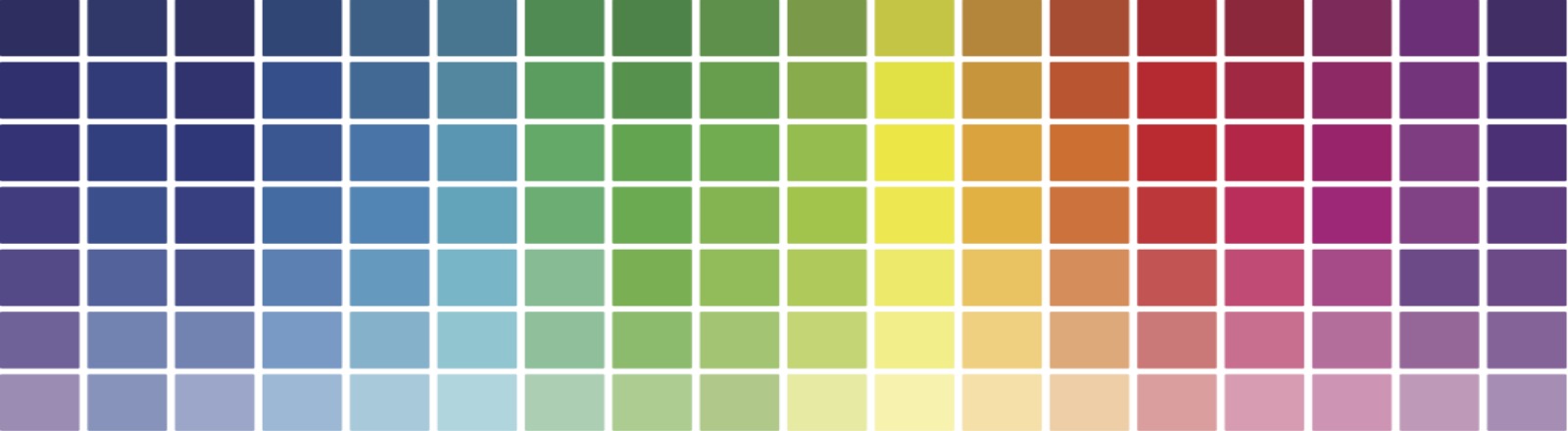
Color is a personal choice, but it also comes loaded with implications.
You may love orange, but are its energetic, cheerful associations right for your actuary firm?
Refer back to your mission and brand personality: are you sophisticated? Then perhaps a royal purple would help get that point across.
If you already have a logo, you should probably start there to help define your colors. For help getting started, check out Google’s super helpful color guide.
You will want 1-2 principal colors, and 1 or more supporting colors, including at least one neutral or grayscale color. The Starbucks color palette is as identifiable as their mermaid logo:

Your style guide should explain when to use your primary color(s)—e.g. in your logo and packaging—and when to use any secondary colors, e.g. in the body text on your website, or as a background in PowerPoint presentations. UC Berkeley does a great job illustrating how to utilize their diverse color palette.
In your style guide, you will want to list the hex codes and/or Pantone number, so that you or someone else (like an employee or a vendor) can easily reproduce your exact desired shade.
Typeface is a wily beast: most of the time, no one except a type-fanatic will notice it. But if you get it wrong, everyone will.
Like with color, a great place to start when you’re deciding which font should represent your company is to look at your logo.
You will want an everyday font, and one or more accent fonts. Your everyday font should be a clean, clear, easy-to-read serif or sans serif that can be used in the body of documents.
Your accent font is usually the fancy treatment that is used in your mark and other places to, well, accent important information.
In your style guide, you will want to list what these fonts are, and also how to use them. Are they bold sometimes and not others? Do you use your accent font only when typing your company name, or can it also be used for other headlines?
A good brand walks a fine line between consistency and agility: it should be easily recognizable, but open to change as your company grows and develops.
Developing a basic style guide gives you a road map to define who you are today, and lays out the route to your business’ future brand identity.
99designs pioneered crowd-sourced design contests, where businesses receive a wide variety of design concepts and choose their favorite. They also provide services for customers to find a graphic designer for a one on one project, purchase logo design templates from the ready-made logo store, or get small design projects done within an hour through Tasks. Learn more at https://99designs.com/.


Get our latest news and information on business finance, management and growth.
